
MyFood
A mobile ordering platform designed to shorten decision time, simplify customization, and improve repeat-order behavior through a faster, clearer mobile experience.
Overview
MyFood is a mobile ordering experience designed for users who often place food orders under time pressure. The product direction focused on helping people move from intent to checkout with less hesitation by making menu discovery easier, customization clearer, and repeat ordering more efficient. Rather than treating the experience as a simple ordering flow, the platform was shaped as a behavior-driven mobile product where speed, confidence, and familiarity directly influence conversion.
Operational problem
Many food-ordering experiences create friction at the exact moment users want speed. Large menus, inconsistent hierarchy, weak customization patterns, and repetitive checkout steps increase cognitive load and make routine ordering feel slower than it should. That friction affects both user satisfaction and business performance by increasing abandonment risk and lowering repeat-order momentum.
- Slower menu scanning during high-intent sessions
- Higher abandonment risk before checkout
- Difficulty returning to preferred meals quickly
- Customization friction that interrupts momentum
- Too many repeated actions for frequent customers
Product direction
The experience was redesigned around a faster mobile ordering model: category-led discovery, cleaner item cards, structured customization, persistent order awareness, and repeat-order shortcuts for returning users. The goal was to improve both immediate usability and longer-term retention behavior without making the interface feel heavy.
Research grounded in direct stakeholder conversations
To make the product direction feel more credible and commercially relevant, I spent time with store associates and customers to understand how they would want a mobile ordering app to behave in practice. The goal was to uncover not only what users say they want, but where convenience, clarity, and speed actually shape decision-making.
- Spoke with store associates about common customer expectations and ordering pain points
- Spoke with customers about browsing habits, preferred ordering speed, and repeat-order behavior
- Reviewed how users think about customization, favorites, and cart confidence
- Identified where long menus and repeated steps increase hesitation
- Used this input to shape the flow, hierarchy, and product priorities
From a food app concept to a behavior-driven product model
Those conversations made it clear that users evaluate a food-ordering app through a small set of practical expectations: how quickly they can find a familiar meal, how easily they can adjust it, how clearly they understand the cart, and how little effort it takes to place the order again later.
- Prioritized category-led discovery instead of deep search dependency
- Reduced repeated steps for returning users
- Structured customization into simpler guided choices
- Strengthened order awareness to improve checkout confidence
- Created a stronger foundation for personalization and smart reordering
Understanding ordering behavior, context, and conversion friction
Research & problem framing
- Gathered expectations directly from store associates and customers through in-person conversations
- Mapped friction points across browsing, item selection, customization, and checkout
- Defined behavior patterns for hurried users, repeat customers, and more deliberate browsers
- Clarified the smallest set of screens needed to support a fast ordering journey
Information architecture
- Organized navigation around category recognition instead of deep searching
- Reduced transition points between browse, customize, and cart states
- Prioritized recent orders, favorites, and shortcut access for returning users
Wireframing
- Explored low-fidelity layouts for browse, detail, customization, and review screens
- Compared navigation patterns for speed, clarity, and reachability
- Refined hierarchy to keep high-value actions visible without crowding the screen
High-fidelity UI
- Built polished mobile screens with strong hierarchy and clearer action priority
- Used consistent spacing, typography, and card structure to reduce visual noise
- Applied a warmer visual tone to keep the experience approachable while preserving clarity
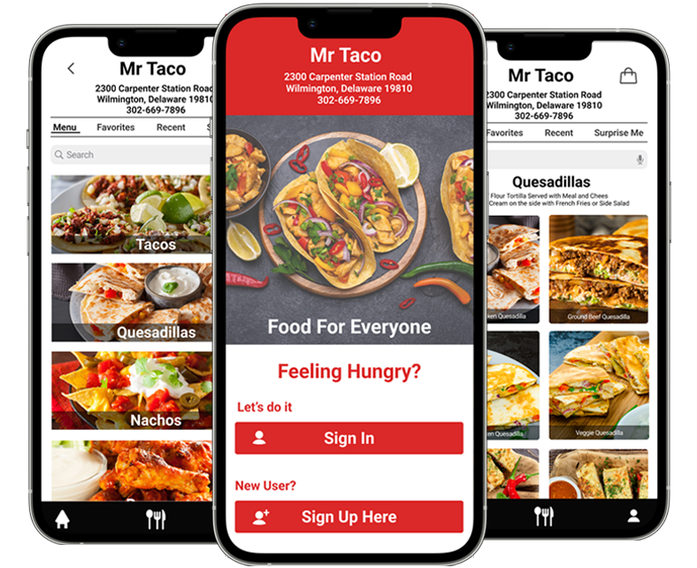
Category-first navigation
Users see food categories immediately, reducing scrolling and helping them make faster decisions.
Visual menu cards
Larger food imagery helps users recognize items quickly and lowers cognitive load during browsing.
Step-based customization
Customization is broken into simple steps instead of showing every option at once.
Clear order summary
A persistent summary helps users stay aware of selections, quantity, and total cost.
Streamlined checkout
Checkout is reduced to three steps: delivery method, payment, and confirmation.
Repeat-order shortcut
Frequent users can reorder quickly without repeating the full browsing flow.
Discovery for this product was not based only on interface assumptions. I spent time with store associates and customers to understand how they would expect a food-ordering app to behave, what would make it feel useful, and where they would likely become frustrated. Those conversations made it clear that speed alone is not enough; users also need confidence that they can find what they want quickly, adjust it without confusion, and complete the order without reprocessing the journey. Stakeholder input also highlighted the business importance of repeat ordering, clearer customization, and a faster path for high-intent users.


Clarifying the highest-value journeys before interface execution
Before moving into polished screens, the main product journeys were mapped to identify where users need acceleration, reassurance, or recovery paths. Feedback from customers and store associates helped clarify that the most valuable journeys were not only first-time browse-to-checkout paths, but also repeat-order behavior, fast customization, and quick recovery when users change their mind mid-flow.


Testing layout patterns before committing to final interaction behavior
Exploration
During early exploration, multiple layout models were tested to determine which structure best supported fast choice-making and low-friction checkout:
- Bottom-tab navigation vs. a more guided single-flow structure
- Grid-based browsing vs. list-heavy scanning models
- Inline customization vs. step-based customization
What worked better
- Step-based customization with fewer simultaneous decisions
- Category-first browsing for faster recognition and movement
- Larger item cards to improve scanning and appetite appeal
These insights shaped the final design direction.
Impact
- Ordering path simplified from a longer multi-step flow to a tighter four-step model
- Menu browsing made faster through clearer categorization and larger visual targets
- Customization clarity improved through guided sequencing
- Repeat ordering time reduced through shortcut-driven access patterns
These improvements support faster decision-making for high-intent users while also strengthening the commercial value of repeat ordering.
Mid-fidelity wireframes were used to test content density, action visibility, and the relationship between discovery, item detail, customization, cart awareness, and checkout. This stage was especially useful for balancing appetite-driven visuals with the need for speed and structural clarity.


Final interface direction built for speed, clarity, and repeat behavior
The final interface direction combines a warm, food-forward visual language with a controlled mobile system that keeps actions obvious and progress easy to understand. The screens were designed to feel appealing enough to support browsing, but disciplined enough to preserve speed and conversion. Store-associate input also reinforced the need for clear item presentation, fewer repeated steps, and a structure that can support both customer convenience and smoother ordering operations.


Personalization, AI support, and retention-focused expansion
Beyond the core ordering journey, the platform can evolve into a more adaptive mobile product by using behavioral patterns to reduce effort for returning users and improve commercial performance.
Smart reordering
- Surface likely repeat meals based on frequency and time of day
- Shorten return journeys with one-tap reorder paths
- Support higher retention through habit-based convenience
Behavioral personalization
- Prioritize favorite categories and commonly selected modifiers
- Adjust screen emphasis based on returning-user patterns
- Reduce search effort by bringing likely choices forward
Operational intelligence
- Promote available items more intelligently during peak ordering windows
- Use recommendation logic to guide users toward high-confidence choices
- Support merchandising goals without disrupting the flow
Commercial outcomes
- Improve completion speed for high-intent sessions
- Increase repeat-order frequency
- Create stronger loyalty through lower-friction ordering behavior