Commercial-grade retail checkout experience

Retail POS System

A production-oriented point-of-sale frontend designed around cashier speed, customer-facing clarity, and real-world register workflows. The system brings together checkout, shift handling, store operations, returns, manager-controlled actions, and deployment-ready frontend structure in one cohesive register experience. This case study focuses on the UX rationale behind those decisions: how the product reduces friction at the register, preserves operational trust, and supports fast, dependable transactions in live store environments.

RoleProduct Design, UX Strategy, Frontend Development
StackReact, Vite, Zustand, HTML, CSS
System scopeCheckout, operations, reporting, employee controls, and production-readiness
Design priorityCashier-first workflow, operational trust, and scalable product growth
01 · Project overview

Designing a POS frontend for real retail operations, not only checkout completion

In many retail systems, the register interface is treated as a narrow transaction surface. In practice, it is the operational center of the store. Cashiers need to move quickly through item entry and payment, managers need controlled access to sensitive functions, and the business needs accurate reporting, shift handling, and traceable money movement.

The system was designed and implemented as the frontend layer of a retail POS product intended for real store operations. The goal was to create a UI that stays fast at the register while also supporting returns, restricted-item approval, employee access, safe drops, paid outs, shift close, reconciliation, and limited register-side reporting without turning the interface into a dense control panel. This case study documents the thinking behind the system: user needs, customer-facing trust, business constraints, interaction rationale, and the product decisions required to make the register experience feel credible in a real store environment.

What the product needed to support

  • Rapid cashier transaction handling
  • Stable cart visibility during live checkout
  • Fast product selection and scan-friendly interaction
  • Payment handling across cash, card, EBT, and split tenders
  • Manager approval for restricted actions
  • Shift and operational cash controls
  • Register-facing reports and shift summaries before backend integration
  • Deployment-safe frontend delivery

Why this problem matters

Every extra click at a register compounds throughout the day. Friction does not only slow transactions—it creates lines, errors, missed approvals, and reconciliation stress. The product therefore had to optimize not just visual layout, but the mental rhythm of retail work: identify the next action quickly, preserve operational trust, and reduce ambiguity under pressure.

02 · Product challenge

Retail checkout is a workflow problem before it is a visual problem

  • Speed pressure — a cashier cannot spend time searching for controls during repetitive transactions.
  • Operational interruption — safe drops, paid outs, no-sale events, and shift changes interrupt the normal sale flow.
  • Governance needs — some actions must be fast but still require explicit managerial control.
  • Reliability risk — if the live build fails routes, assets, or receipts, the interface stops being operationally trustworthy.
03 · Design goals

What success looked like for the system

FasterThe next action in checkout should stay immediately visible and easy to execute.
SaferSensitive actions should be explicit, controlled, and traceable without adding unnecessary friction.
ClearerThe interface should separate sale handling, product browsing, and payment resolution into stable zones.
OperationalShift handling, cash movement, reporting, and employee workflows should feel built-in, not bolted on.
ScalableFrontend decisions should remain compatible with future backend integration.
DeployableProduction hosting and subfolder deployment needed to work reliably, not only local development.
03A · Field research

Research grounded in live register environments

To design the POS around real behavior rather than abstract assumptions, I visited multiple stores and spent time with cashiers, managers, and owners in their working environment. The research focused on the moments that define register trust: item entry, payment transitions, restricted-item approval, return handling, shift routines, and the ways interruptions affect speed.

  • Observed checkout workflows under real transaction pressure
  • Watched how cashiers recover from interruptions and exceptions
  • Reviewed manager intervention points at the register
  • Used existing POS systems to understand strengths and pain points firsthand
  • Mapped how register actions affect both staff rhythm and customer experience
03B · What the research changed

From screen design to register behavior design

The field research clarified that the POS should not be treated as a generic retail screen. It is a live operational surface where every extra click, unclear label, or hidden state affects cashier speed, customer confidence, and manager oversight at the lane.

  • Prioritized stable cart, product, and payment zones for spatial memory
  • Separated routine selling actions from higher-risk manager actions
  • Improved labels and control logic for faster use under pressure
  • Designed around customer-facing clarity as well as cashier efficiency
  • Kept the register UI distinct from the separate admin management product
04 · My role

End-to-end UX strategy, product structuring, and frontend execution

  • Owned product direction, UX strategy, and retail workflow priorities
  • Translated business requirements and store operations into a cashier-first interaction model
  • Designed checkout, store operations, shift handling, reporting, and approval behaviors
  • Defined reusable UI patterns and interaction rules so the system could scale consistently
  • Worked across design and frontend execution in React with Zustand-based global state
  • Used iterative reviews and scenario testing to refine the product without breaking stable flows
  • Established a strong foundation for future collaboration with backend and related reporting workstreams while keeping the POS itself focused on register operations
05 · Collaboration and scope

How the work was framed before backend integration

This case study covers the complete frontend product surface and the decisions that shaped it prior to backend connectivity. The work intentionally established the operational UX, content structure, state model, and deployment-safe foundation first so later engineering work can connect to an already coherent product rather than forcing major UX rework.

The collaboration model for this project reflects how I approach product work in general: clarify the business need, define the user workflow, organize the interface system, and make implementation decisions that reduce future rework. In this POS project, that meant keeping the focus on the register experience itself: cashier actions, manager interventions at the lane, customer-facing clarity, and the operational rules that keep checkout trustworthy. The separate admin dashboard is treated as a related but distinct management product rather than an extension of the register UI.

06 · User research and discovery

Research focused on real retail behaviors, operational friction, and production conditions

The research phase was grounded in direct field exposure. I visited multiple stores and spent time with cashiers, managers, and owners to understand how live register workflows behave in real retail conditions. I also used existing POS systems firsthand to study checkout rhythm, approval moments, return handling, shift routines, and the pain points users face when speed, accuracy, and trust all matter at once. Because the product was being shaped alongside real implementation work, the research combined field observation, legacy-system comparison, scenario-based testing, and iterative validation against register-side needs.

Research methods

Field observation and scenario replay
Visited live store environments to observe checkout behavior, analyze interaction speed, hesitation points, recovery behavior, and repeated cashier actions under pressure.
Task timing analysis
Mapped scan → total → payment sequences to identify where extra clicks, unclear labels, or unstable layouts slowed completion.
Operational edge-case mapping
Tested split payments, restricted items, void-like recovery, no-sale, safe drops, paid outs, and shift-close behavior to identify failure points.
Environment constraints
Designed for small screens, standing use, interruptions, limited training, and constant customer-facing pressure at the register.
Primary research questions

Where does checkout slow down?
Identify moments where visual search, dense content, or ambiguous state forces the cashier to pause and the customer experience to stall.
Which operational actions need separation?
Determine which money and shift behaviors should live outside the main selling flow and require clearer content labels or guarded access.
What requires manager visibility?
Clarify where restricted actions need lightweight governance without freezing the register.
What must be production-safe now?
Ensure that hosting, routing, receipts, and asset behavior are addressed before deeper integration begins.

Key findings

Cashiers rely on muscle memory
Stable placement of cart, product, and payment areas reduces cognitive load, supports faster onboarding, and preserves checkout rhythm.
Operational actions need distinct language
Safe drops, paid outs, and shift-close actions must read like audited store events, not casual utility actions. Content strategy mattered as much as layout.
Interruptions are common
The product must allow users to handle approvals, returns, and cash events without losing context of the active shift.
Receipts and reports affect trust
Users read printouts and summaries as proof that the system is dependable, especially during money movement and shift accountability.

Design principles that emerged

Keep high-frequency actions close
Sale handling must remain visually anchored and easy to scan.
Separate risk from routine
Manager approvals and operational cash movement need visible boundaries.
Use labels that explain action, not style
Buttons and controls should clarify operational intent immediately and reduce training burden for new staff.
Treat deployment as UX
Live hosting, routing, and asset stability are product quality issues, not post-design cleanup.
01

Observed the core cashier loop

Scanned the full sequence from item entry to tender completion to protect rhythm, reduce search time, and stabilize cart awareness.

02

Separated operational actions from selling actions

Defined money movement, shift actions, and no-sale events as controlled system behaviors rather than mixed sale states.

03

Designed for build reliability early

Treated production readiness as part of product quality, solving routing, asset loading, and subfolder deployment before backend work.

Insight 01

Stable spatial memory improves speed

When the cart, products, and payment zones stay fixed, the cashier spends less attention finding controls and more attention completing transactions correctly.

Insight 02

Operational cash actions need explicit boundaries

Safe drops and paid outs are not side notes. They are operational events that require their own records, language, and receipts.

Insight 03

Governance must be visible but lightweight

Manager intervention works best when it is clearly gated and quickly resolved, rather than hidden or over-complicated.

Insight 04

Reporting starts at the interface layer

Even before backend integration, receipts, logs, and operational summaries need a coherent shape so the product behaves like a working system.

Insight 05

Small-screen issues are operational issues

If a low-height device hides critical shift-close actions, the problem is not cosmetic. It blocks completion of a store process and must be treated as a high-priority UX defect.

Insight 06

Live deployment is part of user trust

A blank screen caused by base-path or routing failures is still a user-experience failure. Production hosting was therefore part of the design and engineering responsibility.

07 · User personas

The register experience was shaped around distinct frontline needs, not a generic “store user”

CO

Cashier Olivia

Frontline cashier · high transaction volume · speed-sensitive
Goals
Scan items quickly, keep cart visible, resolve payment fast, avoid blocked actions during busy periods.
Behavior
Operates on muscle memory, handles repeated transactions quickly, and avoids leaving the current checkout context unless necessary.
Environment
Standing at the register in a noisy, interruption-heavy environment with a visible customer line.
Tools
Barcode scanner, touchscreen POS, receipt printer, payment terminal, and cash drawer.
Emotional state
Needs confidence and clarity. Hidden controls or surprise prompts create stress immediately.
MM

Manager Malik

Store manager · shift owner · governance and reconciliation focused
Goals
Control sensitive actions, manage shifts, confirm cash reconciliation, and maintain operational accountability.
Behavior
Moves between oversight and intervention, stepping into the flow only when approval or operational correction is needed.
Environment
Works across the floor and register area, often managing staff, customers, and supplier interruptions at the same time.
Tools
Manager PIN, operational reports, shift summaries, reconciliation drawer, and printed receipts.
Emotional state
Needs the system to signal trust and traceability, especially when cash movement or shift closure is involved.
CN

Customer Nadia

Retail customer · time-sensitive · clarity and trust focused
Goals
Complete purchases quickly, understand totals clearly, and move through payment without confusion.
Behavior
Judges the store experience through line speed, pricing clarity, receipt accuracy, and how confidently the cashier can resolve issues.
Environment
Often waiting in line, making quick decisions, and expecting the register interaction to feel smooth and trustworthy.
Touchpoints
Customer-facing cart review, payment prompts, printed receipt, and manager-assisted moments such as returns or restricted-item approval.
Emotional state
Needs reassurance that the transaction is accurate, fast, and professionally handled.
RS

Relief Staff Daniel

Occasional operator · variable familiarity · error-prone conditions
Goals
Complete standard transactions safely even without deep system familiarity.
Behavior
Moves slower than trained staff, depends more on labels and visible steps than on habit.
Environment
Often steps in during busy or transition periods when mistakes are more likely.
Tools
Main POS interface, guided prompts, product grid, and payment controls.
Emotional state
Needs reassurance and obvious action order. Ambiguity increases hesitation fast.
08 · User flows

Each major product behavior was modeled as a deliberate flow with a clear start, controlled interruptions, and a defined end state

A

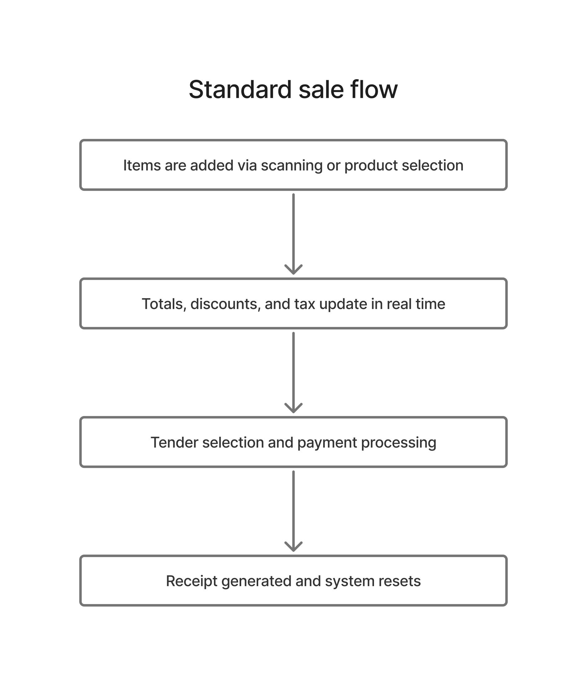
Standard sale flow

  1. Cashier builds the cart through scanning or product selection.
  2. Cart remains visible while totals, discounts, and tax state update in place.
  3. Checkout panel resolves tender type and payment details.
  4. Sale completes, receipt is generated, and the system resets for the next transaction.
B

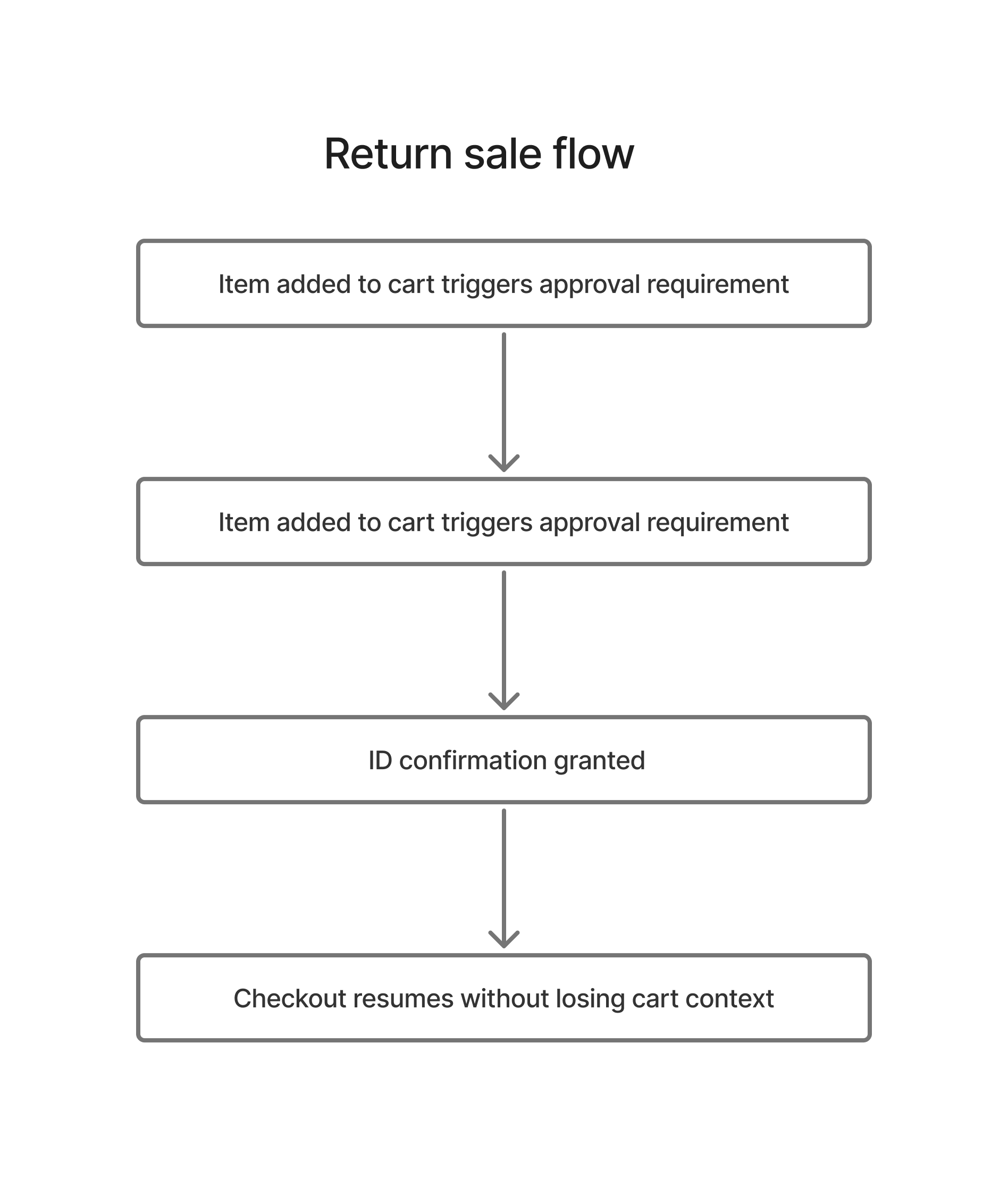
Restricted item flow

  1. Restricted item enters cart and flags approval requirement.
  2. Verification step is triggered in a controlled path.
  3. Manager/PIN or verification confirmation allows continuation.
  4. Sale resumes without losing cart context.


C

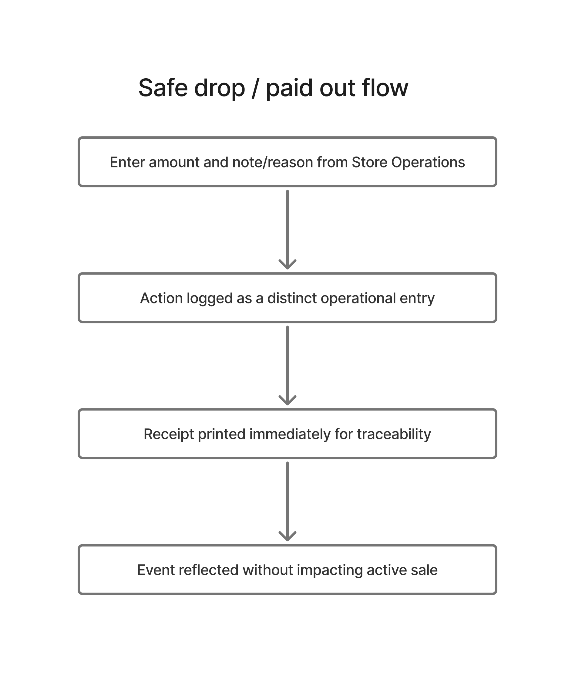
Safe drop / paid out flow

  1. User opens Store Operations and enters amount with note/reason.
  2. Action is recorded as a distinct operational event.
  3. Receipt prints immediately for traceability.
  4. Event contributes to reports and reconciliation without affecting active sales logic.
D

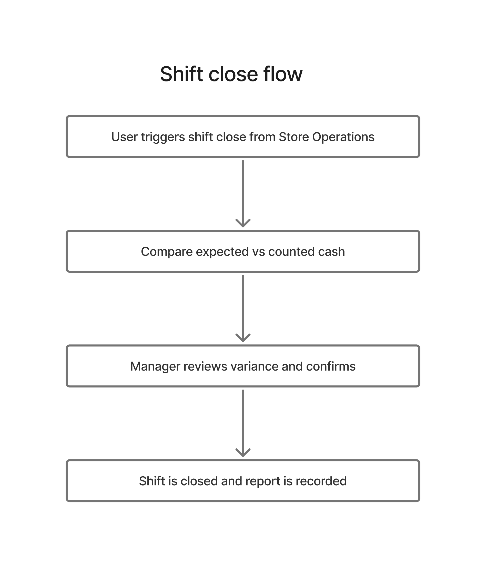
Shift close flow

  1. Close Shift initiates cash reconciliation.
  2. Expected cash, counted cash, and variance are reviewed.
  3. Manager confirms and shift report is generated.
  4. Shift is closed while preserving operational logs and summaries.

09 · Information architecture

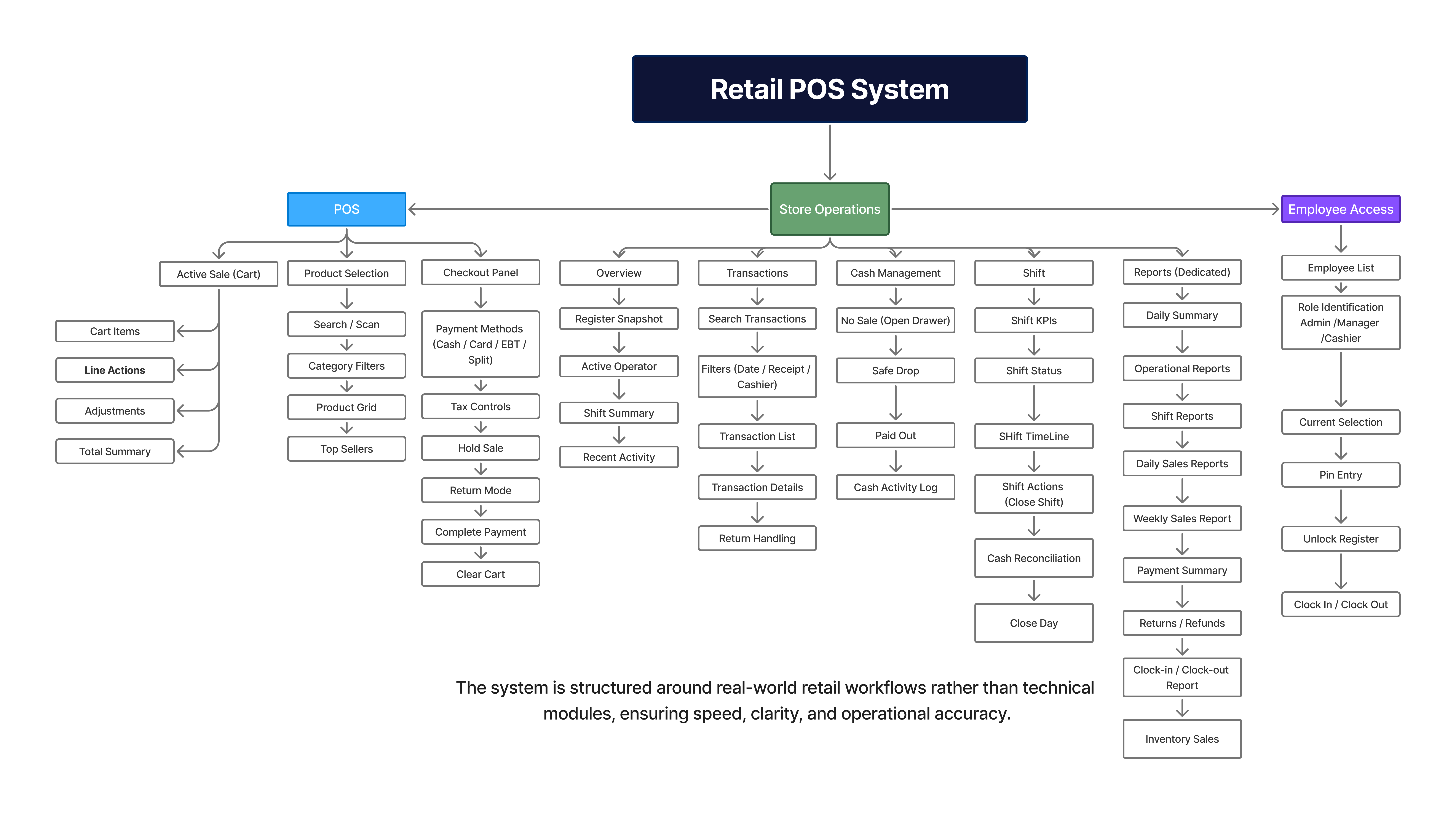
The system architecture was organized around frequency, risk, and role visibility

Top-level structure

Checkout layer
Cart, product selection, payment, receipt output.
Store operations layer
No-sale, safe drop, paid out, shift controls, reconciliation.
Register reporting layer
Shift, day-end, employee, and coupon-aware visibility tied to register operations.
Governance layer
Manager approval, restricted actions, and employee access control at the register.

Architecture logic

Frequency
High-frequency actions stay closest to the active checkout surface.
Risk
Sensitive money and approval tasks move into controlled pathways.
Visibility
Report and shift views remain accessible without cluttering the primary sale workflow.
Scalability
The structure leaves room for later inventory, persistence, and backend-driven state.
Retail POS Information Architecture Click to view full architecture
10 · Wireframing and design evolution

The interface matured through progressive fidelity: low-fi for structure, mid-fi for task clarity, hi-fi for production-ready interaction

01

Low-fidelity framing

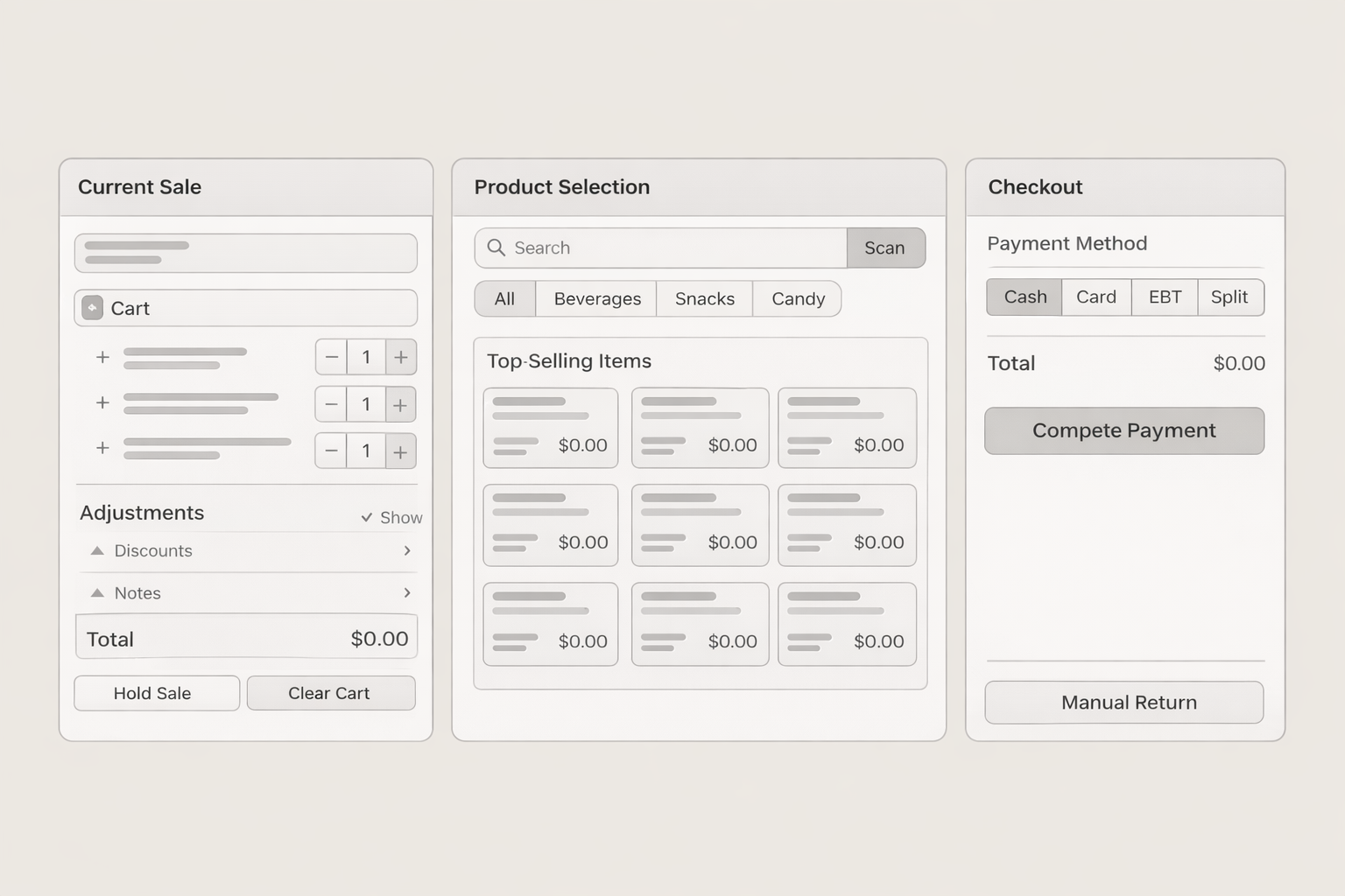
Focused on screen zoning, action grouping, and task order. At this stage the main question was how to separate selling, browsing, and payment without splitting cashier attention.

02

Mid-fidelity refinement

Introduced realistic card groupings, checkout priorities, shift controls, and report structure to test density, labels, and decision points before styling.

03

High-fidelity execution

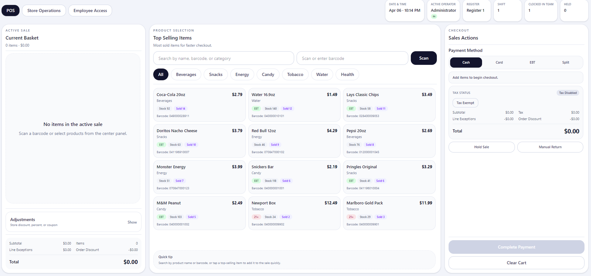
Moved into a full interface system with polished hierarchy, interaction states, role-based controls, printing paths, and deployment-ready frontend behavior.

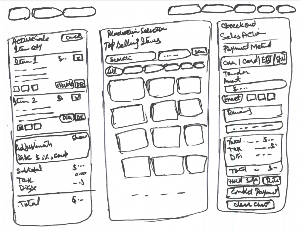
Low-fidelity wireframes

Early layout exploration focused on stabilizing cart visibility, separating browsing from checkout, and preventing cashier context switching during transactions. The purpose here was not visual polish; it was to confirm interaction order and reduce layout indecision early.

Mid-fidelity wireframes

Mid-fi layouts tested specific UI decisions: cart density, visibility of held and return states, payment grouping, operational drawer behavior, and whether the system could support multiple scenarios without visual overload.

High-fidelity UI

High-fi execution translated the structural decisions into a consistent system: role-aware actions, clearer visual hierarchy, production-safe spacing, receipt and report flows, and operational modules that feel integrated rather than secondary.

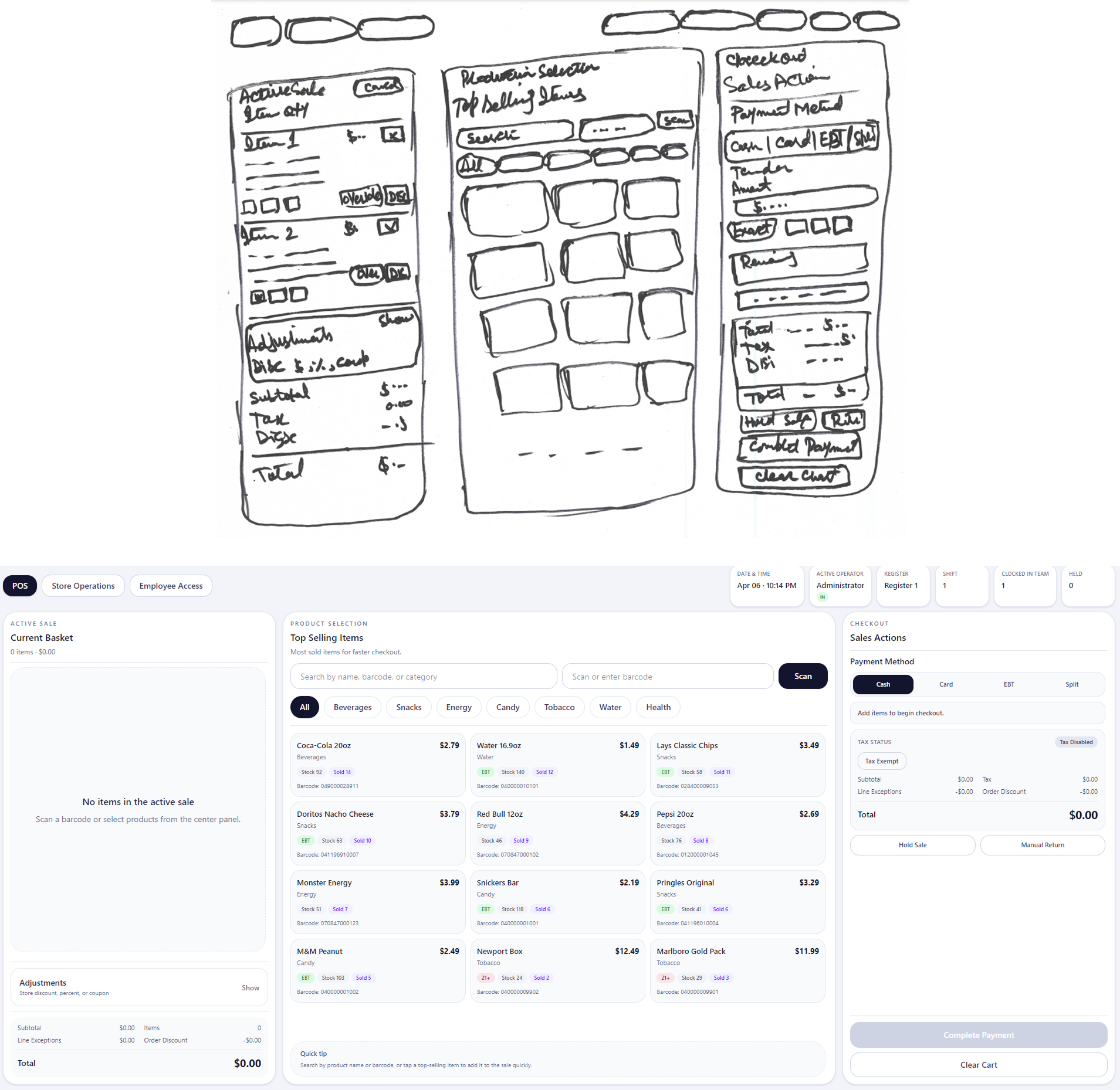
Design evolution comparison

The interface evolved through iterative structural validation, focusing on improving transaction speed, reducing decision friction, and maintaining operational clarity across checkout, product selection, and payment workflows. Each iteration refined layout density, action visibility, and interaction predictability under real usage conditions.

11 · Functional system design

Main features designed and implemented in the frontend

Cashier checkout

Active sale cart, totals, tax handling, discounts, and tender controls built for repeat-speed usage and lower decision friction.

Product selection

Grid-based browsing with clear product organization, quicker visual scanability, and a dedicated middle workspace.

Store operations

No-sale, safe drop, paid out, shift open/close, and cash reconciliation treated as product-level modules instead of hidden utility actions.

Manager approval

PIN-gated flows for restricted items and sensitive actions to balance speed with control, compliance, and audit visibility.

Reporting

Shift, day-end, employee, and coupon-aware reporting surfaced before backend integration so operational visibility was not postponed.

Return support

Transaction-linked returns, receipt lookup logic, and safer refund handling paths that protect both staff and store records.

12 · Design system direction

The interface prioritizes visual stability and fast recognition to reduce hesitation during repeated transactions.

  • Clear column-based zoning to support spatial memory and repeated cashier use
  • Consistent card, pill, panel, and drawer patterns across operational states
  • Dense information controlled through hierarchy, not visual noise
  • Action labels written for operational clarity rather than marketing tone
  • Reusable patterns created a practical design-system foundation for future modules
  • Safe incremental change philosophy preserved existing working flows while the system grew
13 · System execution

Implementation choices were guided by non-breaking product growth and live deployment needs

Frontend architecture

React + Vite

Supported modular page composition and faster iteration through the UI system.

Zustand global state

Coordinated checkout, reports, operations, and shift behaviors without introducing heavy state overhead.

Incremental enhancement

New capabilities were added carefully so working cashier flows and styling stayed intact.

Implementation rules that protected the UX

  • Do not disturb a stable cashier flow without strong reason
  • Keep operational actions separate from sale-completion logic
  • Preserve layout, styles, and interaction rhythm during enhancements
  • Treat printing, routing, and deployment as operational UX responsibilities
14 · Responsive and edge-state handling

Smaller-height systems required functional responsiveness, not just cosmetic resizing

During shift close, the cash reconciliation drawer could hide its bottom actions on shorter screens. The solution was not simply to reduce typography or spacing; it was to restructure the drawer with internal scrolling so the content body remains scrollable while critical footer actions stay reachable.

15 · Production deployment readiness

Preparing the POS for subfolder hosting on the live website

The frontend was prepared for hosting under a production subfolder path. The work included base-path alignment, route behavior fixes, asset-loading validation, build verification, and hosted folder-structure corrections. This ensured the live system at /pos-system/ behaves like a working product rather than a local-only prototype.

  • Resolved Vite build and alias issues
  • Configured correct base path for hosted subfolder deployment
  • Validated production build output and asset references
  • Fixed live routing behavior for the hosted environment
16 · Validation and refinement

Iterative testing focused on whether the system stayed usable under real operational pressure

Checkout refinements

Cart density
Adjusted item visibility so cashiers can see more of the sale at once.
Payment grouping
Reworked payment options and active checkout visibility to reduce confusion.
Restricted-item flow
Simplified verification prompts to avoid slowing the cashier unnecessarily.

Operational refinements

Shift handling
Improved employee access, clock-in logic, and shift-close reliability.
Safe drop / paid out
Added record-and-print behavior so operational receipts match store needs.
Reports
Expanded shift, day-end, and employee visibility before the backend phase.
Content clarity
Refined labels, prompts, and panel language so sensitive store actions read with the right level of seriousness.
17 · Outcome

A stronger frontend product foundation before backend integration begins

Operationally broaderThe frontend now supports more than checkout: it includes reporting, shift handling, returns, operational cash controls, and manager-gated actions.
Lower training frictionClearer structure, action language, and stable spatial patterns reduce how much a cashier has to relearn from screen to screen.
More production-readyHosting, routing, printing, and asset-loading issues were resolved so the live system behaves reliably.
Stronger business visibilityShift, day-end, and employee reporting were designed early so owners and managers can act on store activity sooner.
More scalableThe product can move into backend integration on top of an already coherent user experience and state structure.
Stronger decision rationaleThe product now communicates clearer process, system thinking, and operational decision-making—not just final interface output.

What the project now demonstrates

Operational completeness

The interface now treats cash movement, reports, returns, and shift workflows as first-class behaviors rather than secondary utilities.

Product maturity

The system behaves like a working retail tool with layered controls, clearer role boundaries, and stronger operational language—not just a visual checkout concept.

Implementation awareness

Frontend reliability, hosting, routing, printing, and future integration concerns were handled as part of the product itself.

Next phase

  • Connect the frontend to backend data and services
  • Add persistence for useful operational state
  • Strengthen reporting with live transaction and employee data
  • Expand production resilience for longer-term store usage
  • Introduce role-based personalization for cashiers, managers, and owners
  • Explore AI-assisted insights such as anomaly alerts, sales prompts, and inventory recommendations
  • Continue refining print and operational audit behaviors
18 · AI and growth opportunities

Where the product can evolve beyond the current release

AI-assisted cashier supportUse transaction context to surface smart prompts, suspicious-tender warnings, or age-restricted reminders at the moment of need.
Manager insightsHighlight unusual void patterns, cash variances, or tender mix shifts so managers can review risk earlier.
Owner recommendationsConnect POS and admin data to suggest inventory actions, promotion ideas, and labor-aware operational decisions.

Why this matters

Adding AI is not just about novelty. In this product, AI would be most valuable when it reduces decision effort, catches operational risk earlier, or helps staff act faster with more confidence. That keeps the feature aligned with the core retail workflow instead of becoming a distracting overlay.

Leadership and cross-functional value

This roadmap also reflects how I think about cross-functional product development: define the problem clearly, protect the core interaction model, and identify which capabilities should be staged next across design, frontend, backend, and reporting teams.

19 · Closing summary

A POS system built around how store work actually happens

The value of this project lies in the way product strategy, workflow design, UI clarity, content decisions, and implementation discipline were brought together. The result is a retail POS frontend that protects cashier speed, supports operational accountability, and establishes a reliable foundation for the next stage of product development. It also demonstrates how I approach product work more broadly: starting from user and business needs, shaping system logic, and translating that thinking into scalable interface decisions.

× Expanded view